Round Corp website redesign
What's this project?
The company I work for needed a redesign of their website. They wanted to keep a lot of the elements and style but make it a lot more modern and user friendly. They were keeping the main structure of the site and just wanted the homepage to be uplifted.
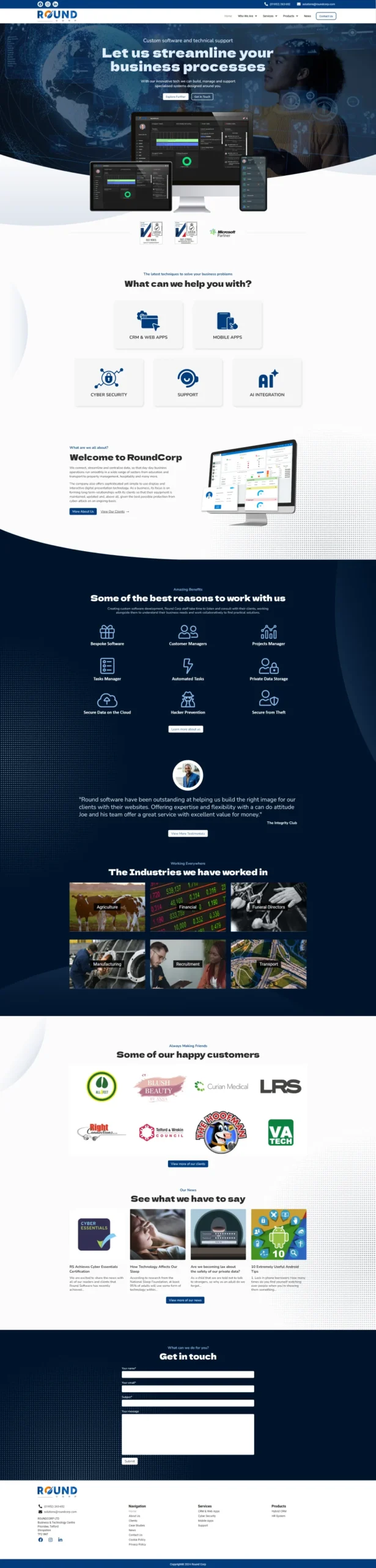
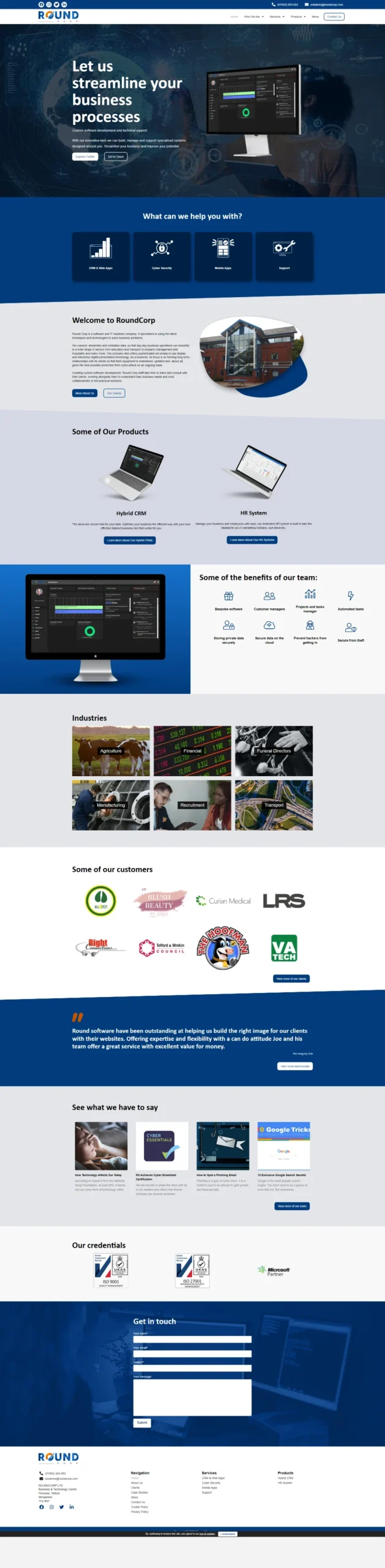
I started with building the UX, they wanted it to remain quite similar however I rearranged some sections to make the journey of the reader more optimised so that a viewer would be able to understand the business easier. After I got the process flow down. I started designing the hero section, the main selling point of the site. This was very important I got right. They wanted to use the same imagry and text so I had to come up with a way that would display the same information but in a more user friendly way. I chose to incorpoirate round edges to the designs as a way for tying in the theme of the company name “Round Corp” additionally, including additional screenshots of the work they have done to better promote their skills.
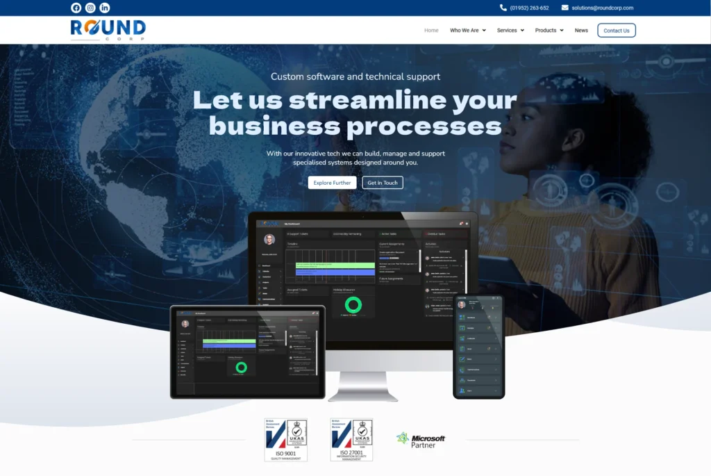
The original site had each section a different colour which seperated everything and was more jarring for the user. For the new design I opted for a simpler look which combined sections and made the site more readble. I also moved text around so the information was not thrown at the user all at once.
For the design I went for a light theme with darker elements. seen by the dark blue section in the middle of the page. The original site had a lighter blue, however I chose to only use that blue for clickable elements such as buttons to better work with UI. I aslo incorporated round elements into the design including gradient ‘bubbles’ and dotted circles to give the impression of digital aspects while keeping the theme round.
Overall I think this design is more modern and sleak to the viewer and it was a lot of fun to turn what was a bulky and unfriendly design into a more rounded off homepage.
OLD
NEW