This company wanted a new logo which would incorporate the different departments that they have, their previous logo was titled “Round Software” but as the company was also working in Cyber Security and Technical support as well, they wanted a logo which didn’t limit them to one specialty. The client specified the new company name as “Round Corp” and wanted a logo that clearly stated that, the colours were provided ans they wanted the main focus to be on the title without a separate symbol.
The logo was a collaboration as another designer was asked to come up with options as well. The other designer came up with the idea of having bold type with the smaller “Corp” underneath, I used this and combined it with my idea of the rounded type (empasised by gradients) and the symbol in for the O, not as a separate symbol but part of the title. The client really like this idea and signed off on it.
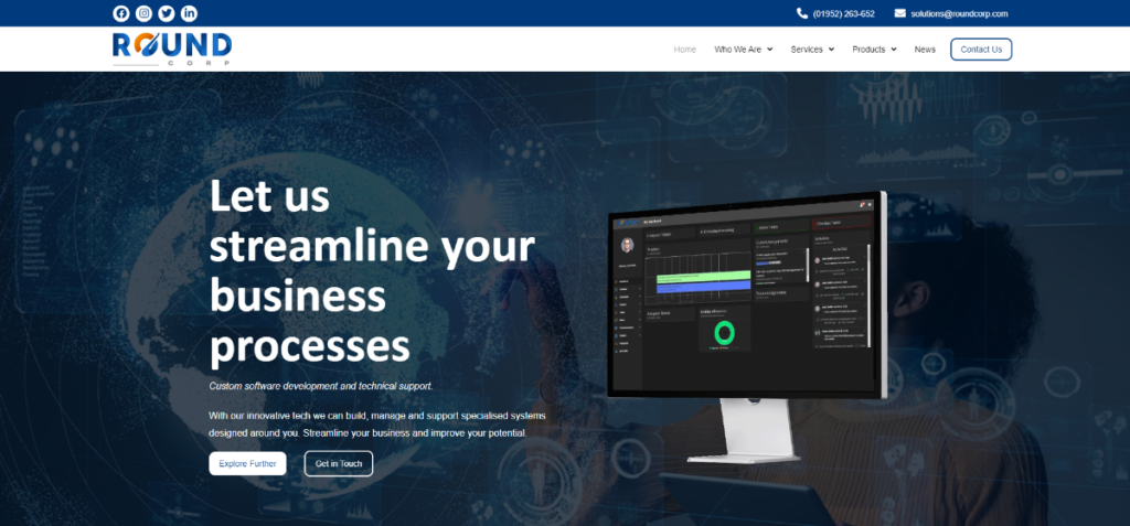
Below is how the logo is looking on the company’s current website.